Blog · · 5min read
How to get your booking page ready: which template, which photos and how much text
Six templates, one colour and a gallery. How to choose based on what you sell and the photos you have, which photos to take with your phone, and the mistake of filling the page with text.
The first decision when you set up your booking page isn’t the hours or the prices. It’s what it looks like, and that’s where a lot of people get stuck: they try all six templates, like three of them, can’t decide and leave the first one. Or worse: they pick the one they like best, not the one that works best for the client opening it on a phone at eleven at night to book a slot.
The template isn’t decoration. It decides how far someone has to scroll before they see the book button, and whether your photos help or get in the way.
The six templates, one line each
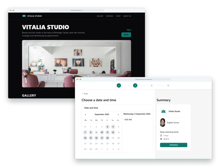
Calendace has six templates, and underneath they all do the same thing: the same five booking steps, the same hours, the same services. What changes is where everything sits and how much weight the image carries.
- Classic. A header with your photo, the name, and the services below. The “don’t make it complicated” one.
- Minimal. Almost no image. Name, services, button. The fastest route to the booking.
- Compact. Everything on one phone screen: details, services and button with no scrolling.
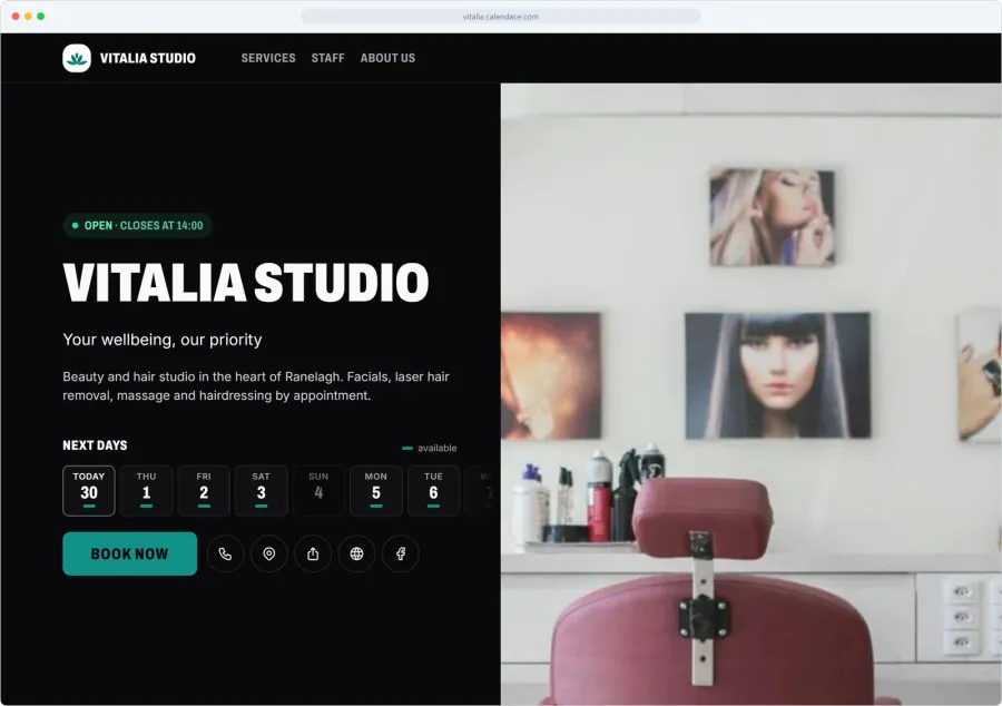
- Split. Split screen: the photo takes one half and the information the other.
- Editorial. Large type, space, text with presence. Looks like a magazine.
- Showcase. The gallery leads. Big photos first, services after.
Which one for which business
The short rule: the more your work sells through the eyes, the more weight the photo should have. The more it sells through trust or convenience, the less.
Neighbourhood barbershop or hair salon. The client knows what they want, comes every three weeks and is looking for a slot. Compact or Minimal. Let them book in twenty seconds. There’s more on this on the barbershops page.
Nails, beauty, lashes. Here the photos sell. A well-shot manicure says more than the service description. Showcase if you have ten good photos; Split if you have two or three very good ones.
Tattoos. Showcase, no question. Nobody books a tattoo without seeing the work. Here the gallery is the business, as we cover in tattoo studios.
Physiotherapy, psychology, therapy. The opposite. The client doesn’t want photos of treatment tables; they want to know who’s going to see them and for booking to be easy and discreet. Classic or Editorial, with a photo of you and short text.
Spa or larger beauty centre. Editorial or Split. They convey calm and leave room for a photo of the space.
If you’re torn between two, pick the one with less going on. You can always change later, and the client doesn’t notice a template change: they notice whether it takes more or less time to find the button.
Which photos to take
You don’t need a photographer. You need half an hour, your phone and daylight.
Natural light, always. Turn off the fluorescent tubes, open the blind and stand with your back to the window or side-on to it. Photos under tube lighting come out yellow or greenish, and no filter fully fixes them.
The space, clean and empty. A shot of the chair or the table with no towels in the way, no product trolley, nobody’s phone on the side. Wipe it down, remove what doesn’t belong, shoot.
The work, up close. A finished cut, freshly done nails, a healed tattoo piece. Close, neutral background, no product logo in the foreground.
Before and after, with permission. These are the most convincing photos and the most delicate. Ask the client before taking the photo, not after, and tell them where it’s going. If they don’t want their face in it, frame only the work. If they say no, it’s no.
You and the team. One photo of each professional, smiling, with the salon in the background. For physio, psychology and therapy this is the most important photo of all, because it’s the one that answers “who’s going to see me”.
With six or eight well-taken photos you have a gallery for any template. With two, pick a template that doesn’t depend on one.
The colour
The theme colour is a single colour, and it goes on the buttons and the details. If you have a logo, use the logo’s colour. If not, one that contrasts with your photos: if the salon is white and wood, a dark green or a blue; if it’s black and neon, the neon.
Avoid very light colours, because the book button has to stand out. And check the page on a phone with the brightness turned down before you sign off on the colour.
The usual mistake: too much text
The booking page isn’t your website. It’s where someone comes to get an appointment, almost always on a phone and often at night. Every paragraph you put between the salon’s name and the book button is a paragraph that person has to scroll past.
What’s needed:
- Name and one line on what you do: “Barbershop in central Leeds. Cuts, beards and shaves”.
- Address and opening hours.
- Services with price and duration. No three-line descriptions: “Cut + beard, 40 min, £22” is enough.
What isn’t: the story of how you opened, the centre’s philosophy, the list of brands you work with, the policies in small print. All of that has its place on your website or on Instagram. Not here.
A quick test: open your page on your phone and count how many times you swipe before you reach the book button. If it’s more than two, something’s surplus.
Before you publish
- Open the page on your phone and on a colleague’s.
- Make a test booking from start to finish, then cancel it.
- Look at the photos on a small screen: one that looks fine on a computer sometimes crops badly on a phone.
- Check the button colour is readable over the header photo.
- Delete half the text you’ve written. It’s almost always too much.
You can change the template in a minute from the dashboard, and the gallery and colour too. What doesn’t change as quickly is the client’s habit: if the first time they open it they book without thinking, they come back. If they have to hunt around, next time they phone.